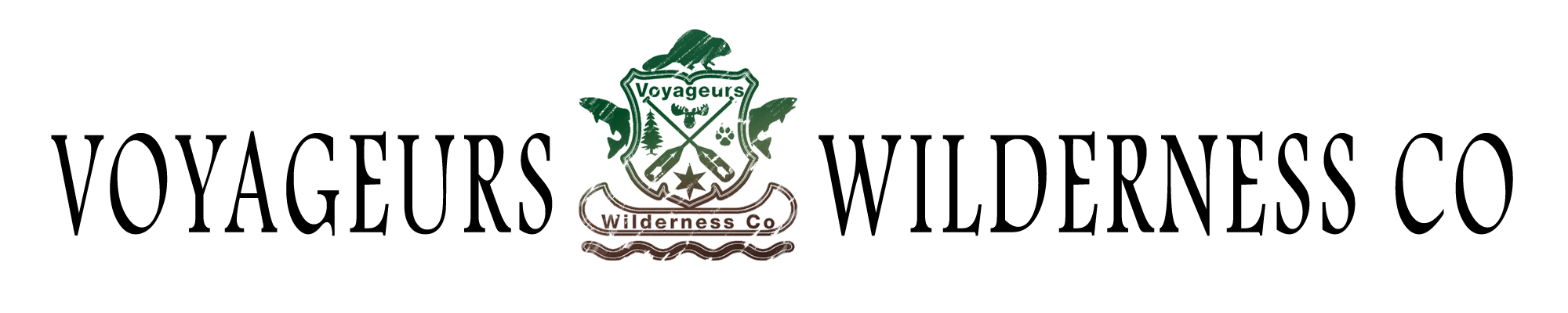

In this post, I hope to discuss our logo. Believe it or not, a ton of thought went into it, and each element defines a part of our journey here.

To break down the parts of our logo:
Blue and Grey field: The background represents the sky. While not always clear, the sky has always been above us and has shown us all-weather, northern lights, snow, warmth and cold, and brings wind and storms while holding the sun and stars.

The General Layout: This is loosely modeled after the Hudson Bay Company. The business model and history we emulate, at least the spirit of adventure and rugged endurance. Some values and attitudes should stay in the past!
The Beaver: We have always admired the hard-working beaver. They never stop and are always working and busy. They cut trees down, build dams, improve habitat by making lakes, and keep water levels high. Due to the beaver, rivers are navigable, and exploration can commence. Their fur is also unbelievably soft and warm.
The Fish: As avid fishermen, we view a healthy aquatic water system as one full of fish, and where there is fish, there is food to continue exploration.
The Canoe: Naturally, it is the travel method in the north and represents exploration and reaching new places. We see the canoe figuratively as our business scope fits a canoe, and literally, we use it to travel.
The Moose: The largest land mammal in North America and an amazing sight to see no matter where you bump into one.
The Black Spruce: A tree of the north. Full of sap or pitch, it burns hot and easily, providing an ample supply of firewood to northern explorers.
The paw print: The print of our dog. He is our constant companion, and his paw print also represents everyone who brings their four-legged companion with them on their expeditions.
The Star: The North Star, the guide of navigation and inspiration to all northern travelers.
The Crossed Paddles: The tools of the trade and forward momentum to all those who ply the northern waters
The Arrows: A representation of our own native bloodlines and to honor the land and rights of all indigenous people for whom lands we cross and explore.
So there you have it; the logo of the Voyageurs Wilderness Company.